End-to-end encrypted email service ProtonMail has refreshed its design, updating with a cleaner look and a more customizable user interface — including the ability to pick from a bunch of themes (dark and contrasting versions are both in the mix).
Last month the Swiss company officially announced passing 50M users globally, as it turned seven years old. Over those years privacy tech has come a long way in terms of usability — which in turn has helped drive adoption.
ProtonMail’s full integration of PGP, for example, makes the gold standard of e2e encryption invisibly accessible to a mainstream Internet user, providing them with a technical guarantee that it cannot poke around in their stuff.
Its new look (see screenshot gallery below) is really just a cherry on the cake of that underlying end-to-end encryption — but as usage of its product continues to step up it’s necessarily paying more attention to design and user interface details…
[gallery ids="2163650,2163649,2163648,2163651"]
Proton has also been busy building out a suite of productivity tools which it can cross-promote to webmail users, using the same privacy promise as its sales pitch (it talks about offering an “encrypted ecosystem”).
And while ProtonMail is a freemium product, which can be a red flag for digital privacy, Proton’s business has the credibility of always having had privacy engineering at its core. Its business model is to monetize via paying users — who it says are subsidizing the free tier of its tools.
One notable change to the refreshed ProtonMail web app is an app switcher that lets users quickly switch between (or indeed discover) its other apps: Proton Calendar and Proton Driver (an e2e encrypted cloud storage offering, currently still in beta).
The company also offers a VPN service, although it’s worth emphasizing that while Proton’s pledge is that it doesn’t track users’ web browsing, the service architecture of VPNs is different so there’s no technical ‘zero access’ guarantee here, as there is with Proton’s other products.
A difference of color in the icons Proton displays in the app switcher — where Mail, Calendar and Drive are colored purple like its wider brand livery and only the VPN is tinted green — is perhaps intended to represent that distinction.
Other tweaks to the updated ProtonMail interface include redesigned keyboard shortcuts which the company says makes it easier to check messages and quick filters to sort mails by read or unread status.
The company’s Import-Export app — to help users transfer messages to they can make the switch from another webmail provider — exited beta back in November.
Zooming out, adoption of privacy tech is growing for a number of reasons. As well as the increased accessibility and usability that’s being driven by developers of privacy tech tools like Proton, rising awareness of the risks around digital data breaches and privacy-hostile ad models is a parallel and powerful driver — to the point where iPhone maker Apple now routinely draws attention to rivals’ privacy-hostile digital activity in its marketing for iOS, seeking to put clear blue water between how it treats users’ data vs the data-mining competition.
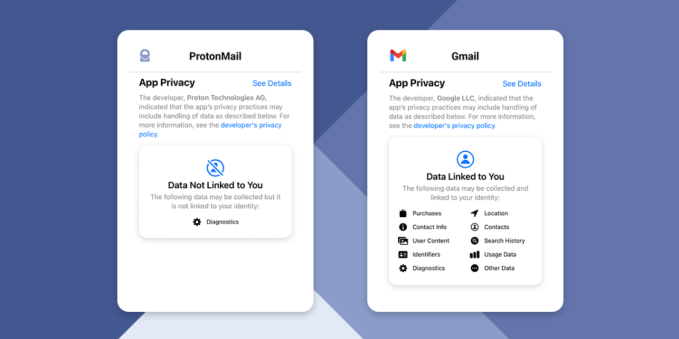
Proton, the company behind ProtonMail, is positioned to benefit from the same privacy messaging. So it’s no surprise to see it making use of the iOS App Privacy disclosures introduced by Apple last year to highlight its own competitive distinction.
Here, for example, it’s pointing users’ attention to background data exchanges which underlie Google-owned Gmail and contrasting all those direct lines feeding into Google’s ad targeting business with absolutely no surveillance at all of ProtonMail users’ messages…

Comparison of the privacy disclosures of ProtonMail’s iOS app vs Gmail’s (Image credits: Proton)
Commenting on ProtonMail’s new look in a statement, Andy Yen, founder and CEO, added: “Your email is your life. It’s a record of your purchases, your conversations, your friends and loved ones. If left unprotected it can provide a detailed insight into your private life. We believe users should have a choice on how and with whom their data is shared. With the redesigned ProtonMail, we are offering an even easier way for users to take control of their data.”
source https://techcrunch.com/2021/06/09/protonmail-gets-a-slick-new-look-as-privacy-tech-eyes-the-mainstream/


No comments:
Post a Comment